An short article in knowing Data Science…
Turning raw data to something useful — is the most important role of a data scientist. In this article, tools and statistical techniques will be discussed with the hopes of guiding aspiring Data Scientist.
Step 1: Data Preprocessing
Raw data are usually unstructured, unorganized, and unusable. Data preprocessing is required to prepare the data to be used in regression, classification, and/or prediction.
1.1. Know your Data Types
Numeric — data are expressed on numeric scale which can be Continuous (Float) that can take on any value in an interval or Discrete (Integer) that can only take counting numbers. 1.25 and 125 are examples of Float and Integer, respectively.
Categorical — data can take only a specific set of values representing a set of possible categories which can be Binary (Boolean) that only has two categories, and Ordinal that has an explicit ordering or classification. On/Off is an example of Boolean, while Low/Middle/High is an example of Ordinal.
1.2. Data Structure for Statistical and Machine Learning (ML) Models
Data Frame — or Rectangular Data is the basic data structure for statistical and machine learning models.
Feature — or Independent Variable is a column or a group of columns within a table that can be used as input, attribute, or predictor for the outcome or target. In a mathematical formula, Features are usually refer as “X” variables.
Outcome — or Dependent Variable is a column or a group of columns within a table that shows the outcome or result. In a mathematical formula, Outcomes are usually refer as “Y” variables.
Record — or Tuple is a row within a table which has both outcome and features.

In the sample dataset shown above, the whole table is called a data frame. The Column, Species, is the Outcome, and the rest of the columns are the Features.
Nonrectangular Data Structures
Time Series Data — records successive measurements if the same variable where Y Variable is the X(t) and X Variable is the X(t-n), which means, time series data’s columns are both dependent and independent variables which relates from a certain time (t).
Spatial Data Structures — used in mapping and location analytics. In Object Representation, the focus of data is the object and spatial coordinates. In Field View, focuses on small units of space and the value of a metric such as pixel, brightness, hue, etc.
There are other data structures that can be developed depending on the purpose and the goal you are trying to achieve.
import pandas as pd
dataset = pd.read_csv('/content/drive/MyDrive/IRIS_DATASET.csv')
Shown above is a sample of python code for your program to read your dataset.
1.3. Central Tendencies and Location Estimation
Mean — or average is the sum of all values divided by the number of values.
Median — or 50th percentile is the value that one half of the data lies above and below.
Percentile — or quantile is the value such that P percent of the data lies below. Usually in 25%, 50%, and 75%.
Outlier — is a data value that is very different from most of the data. This is usually treated by removing or replacement.
1.4. Variability Estimates
Deviation — or residual is the difference between the observed values and the location estimate.
Variance — or mean-squared-error is the sum of squared deviation from the mean divided by (n-1) where n is the number of data values.
Standard Deviation — is the square root of the variance.
Range — is the difference between the largest and the smallest value in the dataset.
import pandas as pd
dataset = pd.read_csv('/content/drive/MyDrive/IRIS_DATASET.csv')
dataset.describe()

1.4. Data Distribution
Boxplot — is based on percentiles and give a quick way to visualized distribution of data.
import matplotlib.pyplot as plt
ax = dataset[['Sepal Length', 'Sepal Width', 'Petal Length','Petal Width']].plot(kind='box', title='boxplot')
plt.ylabel('centimeters')
plt.show()
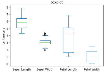
The top and bottom of the box are the 75th and the 25th percentiles, respectively. The median is the horizontal line in the box. The whiskers or the line that extend outside the box, is the range or the maximum and minimum value. Any data outside the range which has a symbol of “o” are the outliers.
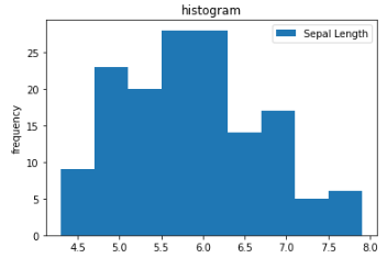
Histogram — is a way to visualize a frequency table. This is use to identify the skewness and kurtosis of the dataset. Skewness refers to whether the data is skewed to larger or smaller values, and kurtosis indicates the propensity of the data to have extreme values.
import matplotlib.pyplot as plt
ax = dataset[['Sepal Length']].plot(kind='hist', title='histogram', bins=9)
plt.ylabel('frequency')
plt.show()
from scipy.stats import skew
from scipy.stats import kurtosis
print(skew(dataset[['Sepal Length']]))
print(kurtosis(dataset[['Sepal Length']]))

A bell curve distribution is most advisable. To learn more about this, you may refer to this link.
1.5. Data Correlation
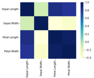
Correlation Coefficient — is a metric that measures the extent to which numerical variables are associated with one another. Usually in the range from -1 to +1.
Correlation Matrix — is a table where the variable are shown on both rows and columns, and the cell values are the correlation between the variables.
Scatterplot — is a plot in which the x-axis is the value of one variable, and the y-axis is the value of another.
import seaborn as sns
sns.heatmap(dataset.corr(), square=True, cmap="YlGnBu")
plt.show()
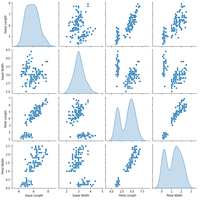
import seaborn as sns
sns.pairplot(dataset.dropna(), kind ='scatter', diag_kind='kde')
plt.show()
1.6. Data Visualization
The most effective way in understanding the data is through data visualization. The previous sections also shows results in graphical presentation for easy understanding. Data can also be shown the same way, and might provide visual patterns, relationships, and even outliers.
cmap_bold = ListedColormap(['blue', 'orange', 'green'])
labelled_species = [
'Iris-setosa',
'Iris-versicolor',
'Iris-virginica',
]
for idx, label in enumerate(labelled_species):
dataset.Species = dataset.Species.replace(label, idx)
markers = {
'Iris-setosa': {'marker': 'x', 'facecolor': 'k', 'edgecolor': 'k'},
'Iris-versicolor': {'marker': '*', 'facecolor': 'none', 'edgecolor': 'k'},
'Iris-virginica': {'marker': 'o', 'facecolor': 'none', 'edgecolor': 'k'},
}
plt.figure(figsize=(16, 10))
for name, group in dataset.groupby('Species'):
species = labelled_species[name]
plt.scatter(group['Sepal Width'], group['Petal Length'],
c=cmap_bold.colors[name],
label=labelled_species[name],
marker=markers[species]['marker']
)
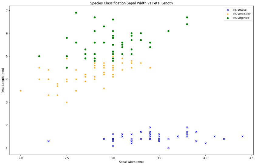
plt.title('Species Classification Sepal Width vs Petal Length');
plt.xlabel('Sepal Width (mm)');
plt.ylabel('Petal Length (mm)');
plt.legend();

In the graph shown, we can assume that the Iris-setosa have shortest petal with usually average length sepal, the Iris-versicolor has average length petal with less than average length of sepal, and the Iris-virginica has the longest petal with usually less than average length of sepal.
There are data visualization tool that can be used in the industries, such as Tableau. If you want to learn about Tableau, you may refer to this link.
Step 2: Prediction
There are various models we can use to predict the outcome or the dependent variable with the given independent variables or features. Depending on your needs, you may use the models in this link. Please note that models will always depend on the available data, and the expected output.
In pre-modeling stage, the dataset should be re-group into Train and Validation Sets [80:20]. In some cases, it may be re-grouped into Train, Test, and Validation Sets [70:15:15].
from sklearn.model_selection import train_test_split

train, val = train_test_split(dataset, test_size=0.2, random_state=11)

x_train = train.drop(columns=['Species'])
y_train = train['Species'].values

x_val = val.drop(columns=['Species'])
y_val = val['Species'].values
The code above uses sklearn library and the function train_test_split. It create two datasets from the original dataset. The dataset inside the train_test_split function is the name given to the dataset to be split. The test_size determine the percentage of test dataset to be created, in this case 0.2 then 20% of the whole dataset will be the test dataset. The random_state controls the shuffling process, making it 0 will follow the data entry in splitting the dataset.
In order for the model to function, the dependent and independent variable will also be separated. Dropping the column “Species” retains the independent variables. Maintaining the column “Species” means retaining dependent variable.
You may also manually separate the dataset by using .iloc[:] in getting the certain range of data entry from point A to point B as Train, then point B+1 to point C as Test, and point C+1 to point D, as Val, where point A to point D is the whole dataset. Please note that the first entry always start with 0.
Example: train = dataset.iloc[0:99], test = dataset.iloc[100:129], and val = dataset.iloc[130:149]
from sklearn.linear_model import LogisticRegression
model = LogisticRegression(solver='lbfgs', multi_class='multinomial', max_iter=500, tol=0.1)
model.fit(X=x_train, y=y_train)
The code above uses sklearn.linear_model and Logistic Regression. To further understand the function of Logistic Regression, you may refer to this link.
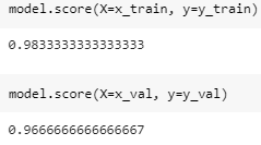
The model score is a predicted probability score of a given event using a logistic regression model. By comparing the score of train and test scores, we can presume that our dataset is somewhat overfitted. Overfitting and Underfitting will be a different topic to be discussed soon.
y_train_predict = model.predict(x_train)
y_val_predict = model.predict(x_val)
To see the actual prediction made by the model, we will be using model.predict(). For comparison purposes, we will be using the panda concatenate.
Compare_train = pd.concat([pd.Series(y_train, name='true'), pd.Series(y_train_predict, name='predict')], axis=1)
print(Compare_train)

Compare_val = pd.concat([pd.Series(y_val, name='true'), pd.Series(y_val_predict, name='predict')], axis=1)
print(Compare_val)

Proving the model score, there are predictions that are not correct. This article does not also cover the error management and it may be discussed in the future articles.
More than 95% prediction percentage and accuracy are usually acceptable.
To actually use its predictive function, you will also use the model.predict() but with the parameters not included in the dataset. Meaning, it is an attribute or feature that is new.
model.predict([[6.4,2.8,5.6,2.1]])
The dataset has multiple features, X1 is Sepal Length, X2 is Sepal Width, X3 is Petal Length, and X4 is Petal Width. In the example shown above, X1 = 6.4, X2 = 2.8, X3 = 5.6, X4 = 2.1
The result is Iris-virginica.
Author’s Note
While this article still lacks a lot of major information about data science, this will provides initial insights and ideas for those who are interested. Data Science is applicable to (if not all) majority of the professional and business fields.
Knowing your data, pre-processing your data, pre-modeling, modeling, prediction, and optimization, these are just general procedures to follow in data science. Mastery in each field is essential to becoming a full pledge data scientist.
Join your local communities of data scientist! Enroll to a prestigious institute or universities that offers Data Science Program! Learn online through e-trainings and webinars!
Data is valuable. Let us learn to harness it!

Leave a comment